Recently, while helping a client mark up a Shopify theme, I came across a thorny problem: how to merge the output of one loop with that of another in a seamless fashion. Allow me to explain.
Most Shopify themes include a "collection template" where products are listed via a Liquid loop. Figure 1 shows how such lists often take shape.
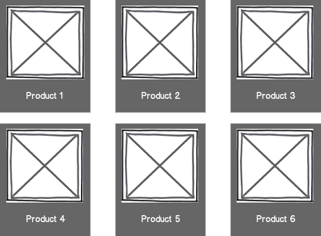
If you're not averse to using TABLEs for such layouts, Liquid has you covered with its TABLEROW tag (reference). If grid-systems are more your speed, you'll want to employ some kind of row wrapping hack, since Liquid doesn't have an each_slice() enumerator or modulus operator.
But if you, like me, think the semantically appropriate markup for a product list is an unordered list (UL), you're committed to working with a stream of LIs.
As I mentioned above, this design required that a list of product collections appear inline with the list of products, but not just anywhere. It was supposed to be the third item in the first row, as shown in Figure 2.
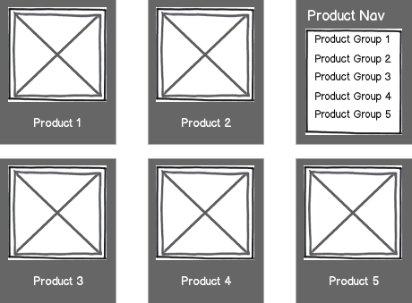
Now, I didn't want to start one loop, stop it, start another, stop it, then start the first one again with an appropriate offset. That seemed too manual. Again, I wanted the output to be a stream of LIs like so:
So, that left me with two choices for laying out this stream of LIs: floating and clearing them or inline-blocking them.
It's easy enough to imagine how you could achieve the desired layout with floats, floating each LI left, except for the first one, which would be floated right. But the floating option requires careful clearing—both the UL itself and every third LI (starting with the first) must be cleared in order to avoid the problem revealed in Figure 3.
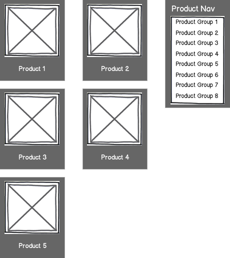
Liquid's CYCLE tag (reference) is a handy way of doing this, as is CSS3's positional pseudo selectors. But, when IE7/IE8 support is required, cycling's the better bet.
Still, this house of clearing cards felt brittle to me, so I endeavored to put the aforementioned inline-block listing techinque to work.
Which got me most of the way there, as Figure 4 demonstrates.
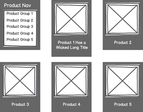
Though the inline-block technique freed me of clearing concerns, I still had to contend with the positioning challenge of the design: the product navigation list was supposed to be flush right in the first row. Floating it to the right wasn't the answer either, as that would subject our layout to the same risk shown in Figure 3.
That's when I had a crazy idea: what if I changed the language direction of the UL so that the list would display right to left? Emboldened by a recent Chris Coyier article, I decided to give it a whirl. Here's what I ultimately came up with:
As you can see, I had to change the language direction on the containing UL, then reset it on elements within its LIs (for some reason, reseting the language direction on the LIs themselves didn't work in Opera). I also had to set the font size on the UL to zero in order to avoid this.
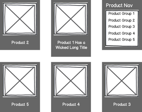
Since the listing of products in this store didn't require specific ordering (alphabetical, price, etc), it was okay for the output to flow right to left, as shown in Figure 5.
While there are pros and cons to both floated and inline-blocked layouts, I thought the latter was a little more elegant in this situation. Have any of you run across this? Are you haunted by lists?